
.jpg?width=48&name=unnamed%20(11).jpg)
Too long and complicated checkout is among the top 5 reasons why people abandon an eCommerce site. For this reason, store owners optimize their checkout page design to simplify the process. For example, they lower the number of fields required to place an order or replace the dedicated checkout page with a pop-up counterpart.
However, even if you reduce the number of form fields to a minimum or provide numerous payment options, one thing may divert visitors from buying: the checkout steps. If each of them takes a separate page (the so-called multi-page checkout), the user will have to wait for each stage to load. This increases the chances of cart abandonment.
That's why many eCommerce platform providers like Shopify introduced a solution: a single-page checkout, which presents all the information on a single page. If you want to learn whether this option is right for you, how to create a new one-page checkout, or how to optimize an existing one, read on.
What is a single-page checkout? Definition and types
A one-page checkout is an approach to organizing the process with all the checkout forms located on one page. These forms can include:
- Cart contents.
- Customer information.
- Shipping details.
- Payment methods.
- Order confirmation.
Consider this case: you've spent a lot of time and effort finding the perfect product. When you proceed to checkout, you see several pages dimmed. You can access them only when you finish the steps on the current page. How many form fields will you have to fill in? How long will the entire checkout process take? You start to lose patience.
It could be much more comfortable to assess how much you're required to do right from the get-go. For example, if you could expand all the accordion fields or see all the sections.
Consider another example. You've filled in the details but want to change something. In the multi-page case, you'll have to make an extra click. The page will take some time to load. Moreover, the unfinished progress may be lost. It's not a very user-friendly customer experience.
A single-page checkout allows online shoppers to view the information without having to click back and forth and risk disrupting the process when the internet connection is lost. As a result, one-page checkouts streamline the path from cart to completion, especially for those shopping on mobile devices.
But what if a one-page checkout doesn't bring the desired results? To delve into the details of this issue, go through the website user experience audit. It’ll help you identify any obstacles in the checkout process that may be hindering conversion rates or overall user satisfaction. After that, make sure to proceed with the user experience optimization process to eliminate the uncovered issues.
Types of one-page checkouts
Even if there’s only one checkout page, there are various ways to organize order details within it. Here are three typical types of one-page checkouts:
- A single checkout page. It's a standard checkout process. Here, you can complete transactions on one page with just a few clicks. From inserting a shipping address to payment details, this checkout layout typically lets you do everything in any order. Note: It's not a one-click checkout. A one-click checkout bypasses the stage of leaving details like shipping information as they should be entered before landing on the checkout page.
- Accordion checkout. If your online store offers this type of checkout, it sections the process into collapsible parts on a single page. Each should expand only after the user has completed the previous step. In this case, the information doesn't overload the shopper. They access it piece by piece, so the checkout experience becomes less daunting. Users can focus on one section at a time, which is especially useful for complex purchases where no detail should be missed.
- False single-page checkout. It has a single-page layout but allows access to data fields only after certain sections are filled out and submitted. So, you have to stick to a predefined order and follow the route in an organized way. It looks like a single-page checkout because all the information is on one page, but it imposes some restrictions on customers. It's a clever design choice for eCommerce stores that want to simplify the checkout experience without creating multiple pages.
Continue reading to find examples of stores using these types of checkout.
Benefits of organizing the checkout on one page
Streamlined checkout process
One-page checkout removes the usual disruptions inherent in a multi-page process. In fact, each time the user has to wait, they may think of leaving the page completely. The one-page layout drastically reduces these exit points by condensing the process. It keeps the shopper engaged and less overwhelmed with the progression across different pages.
The positive effects of this approach extend beyond a single purchase. According to statistics, customers who are satisfied with the user experience are more likely to return to the store for more. For example, 74% of visitors are likely to return if your website provides a positive mobile UX.
Reducing cart abandonment
One of the most common reasons customers close the website without purchasing is the complexity of checkout processes. Some complain that an eCommerce store has no guest checkout option. Others get bogged down with multiple forms. By placing all the checkout features on a single page and reducing them to the bare essentials, you eliminate the tediousness that may prevent people from buying.
Improving conversion rates
As a consequence of the previously discussed benefits, single-page checkout also contributes to higher conversions and revenue. Fewer distractions when navigating the elements mean less decision fatigue. So, prospects are more inclined to complete payment. You can further enhance the experience and include tactical features like:
- Auto-fill for returning customers.
- Dynamic updates of costs (like shipping and tax).
Drawbacks of one-page checkouts
Endless page scrolling
Many people criticize single-page checkouts for the necessity of long scrolling. ECommerce businesses squeeze the checkout process but end up creating a long page with dozens of required fields.
This can be particularly cumbersome on smaller screens and mobile devices. Imagine having to scroll for several seconds just to come back to the shipping address fields to change the shipping method. This can disrupt the user experience and, ironically, may lead to cart abandonment, which is the very issue this setup aims to reduce.
How to counter this: Optimize the checkout design. If you require too many details, consider implementing accordion sections that expand and collapse or opening the section in a pop-up. These solutions can reduce the perceived length of the checkout page.
The need to compromise on additional features
You need to place everything on one page, so some trade-offs are necessary to avoid cluttering the checkout experience. One of the first features that you might have to remove is an upsell block.
Let's assume you have a three-page checkout. It enables you to integrate strategic prompts and additional product recommendations on the first page before the customer fills in critical information that can impact shipping costs. Here, they can be more likely to add more products to the order. With a one-page layout, these moments can overwhelm the shopper or detract from the streamlined experience.
How to counter this: Move the upsell section to a "Review cart" page.
Increased loading times
While people don't need to load several pages, they still need to open one. It can become too heavy due to the increased amount of data if you don't work on speed enhancement. As a result, the page loads too slowly. Loading speed is among the factors impacting conversion, bounce, and dropout rates, especially for users with slower internet connections and mobile shoppers.
How to counter this: Optimize image sizes, use faster, more efficient coding practices, and leverage advanced web technologies like AJAX, which loads data asynchronously. Additionally, the checkout process must be tested under various conditions and continuously monitored for page performance.
Potential overlooking of details
You need to put a lot of details on one page:
- Shipping options
- Payment method
- Billing address
- Promo codes
For this reason, the checkout layouts can be too saturated and distract attention. Users may make mistakes or miss critical sections, potentially increasing customer service contacts after the purchase.
How to counter this: Implement clear and distinct visual cues and interactive form elements to guide users through the one-page checkout process, such as:
- Real-time validation by checking the entered data and asking the user to fix the problem if there is one.
- Tooltips that provide information when hovered over or clicked.
Key features of effective one-page checkouts
So, what should a one-page checkout include? Let's break down its essential elements and features.
1. Design elements
Mobile-first approach
ECommerce has grown in popularity with consumers, also causing mobile commerce to gain traction. While mobile traffic has been steadily replacing desktop, conversions on smartphones have been traditionally low. Why? Because store owners neglected mobile optimization.
It was convenient to look through product images, descriptions, and prices, but finishing the order from mobile was a nightmare. Fortunately, online merchants started to give mobile design more attention. Nowadays, customers expect the mobile experience to be on par with the desktop one.
What you can do:
- Switch to responsive design or create the page tailored to smaller screens from the get-go.
- Employ larger form fields, buttons that are easy to tap, and text that is readable without zooming.
- Consider the thumb's reach and place vital elements like the main CTA button within easy reach as the user holds their device.
Visual hierarchy and focal points
Visual hierarchy serves to specify the main headings, sections, and elements.
What you can do: Use size, color, and contrast. For example, highlight your primary call to action (CTA), such as"Complete purchase" or its variations. It should stand out from the rest of the content but still fit organically within the overall design aesthetic.
2. Technical aspects
Dynamic updates of order summaries and pricing
The checkout page should dynamically update as the user inserts new information, such as shipping methods, quantities, or payment options. All the changes should be illustrated in the order summary and total pricing. This keeps the user informed and helps prevent the shock of unexpected costs at the final stage.
What you can do: You may need to edit the backend logic and custom code. It’s a technical challenge but it can be crucial for transparency and trust.
Integration of security features and trust seal
To leave sensitive details, consumers should trust you.
What you can do:
- Integrate visible security assurances like SSL certificates, trust seals, and secure payment options.
- Display these symbols prominently on the checkout page.
- Comply with data protection standards, such as the GDPR, to build trust and shield the business from potential legal consequences.
This also involves being transparent about data usage and adding options for customers to manage their data preferences easily.
Incorporation of customer support options
These features may include live chat or a quick-access help button. Embedding them directly on the checkout page can significantly simplify customers' experiences. Whether they have any last-minute queries or concerns, assisting them through sticking points in the purchase process can secure the deal.
Connecting checkout with business systems
The checkout page should supply your systems, such as enterprise resource planning (ERP) and customer relationship management (CRM), with valuable insights without manual intervention. The goal? To store the freshest information about your customer base and manage inventory.
At the same time, these platforms should inform buyers whether the products are still in stock. This saves on the operational hassle of managing backorders and prevents customer dissatisfaction.
3. User interaction
Minimizing input fields and leveraging auto-fill technology
The fewer fields people need to fill, the higher customer satisfaction and completion rates are.
What you can do: Minimize the number of input fields, such as:
- Combine first and last name fields.
- Utilize zip code-based auto-fill to input city and state.
- Allow billing addresses to be replicated as shipping addresses with a simple checkbox.
Furthermore, make sure that your one-page checkout supports auto-fill technology. It's when the system inserts the user information stored on their devices to auto-populate fields. The benefits of such technology go beyond streamlining the process and also include minimizing the potential for input errors.
Modern solutions like artificial intelligence may also help. AI can offer predictive input that suggests information based on the first few characters typed into a form field. Or, it can personalize the checkout user experience and display previously used shipping addresses or preferred payment methods.
Accessibility and usability considerations
Accessibility is a new norm for eCommerce websites. Your checkout page should be accessible to people with disabilities and understandable if there are mistakes. It should clearly communicate what happened, what's wrong, and how to fix it.
What you can do: Implement features like screen reader support, keyboard navigation, and adequate color contrast. Optimize your error messages to be clear and helpful. For example, instead of a generic "Invalid input" message, specify with "Please enter a valid email address."
Real-world examples and case studies
1. Peloton
.png?width=504&height=700&name=unnamed%20(17).png)
Screenshot taken on the official Peloton website
Implementation style: true one-page checkout
Here, we see quite a lengthy single-page checkout that encapsulates all the elements necessary for buying high-ticket goods. Peloton, renowned for its fitness equipment and digital classes, succeeds in the following:
- Integrated account creation: You can sign up with Apple, Google, or email right at checkout. You can choose when to do it: before filling in the fields or after.
- Clarity in cost and terms: The cart summary clearly shows the total cost upfront, along with financing options.
- Engagement features: Including a warranty upsell within the checkout is a smart move to increase average order value without being too intrusive.
Yet, there is one major drawback:
- Potential overload: There is a lot of information on one page. It can overwhelm some users and slow down the decision-making process.
2. Zara
.png?width=493&height=494&name=unnamed%20(18).png)
Screenshot taken on the official Zara website
Implementation style: true one-page checkout
Zara's one-page checkout introduces a mixture of style and functionality. The page is cleanly designed, emphasizing minimalism that’s a hallmark of the brand.
Another strength is that Zara automatically adjusts the page according to the region of the user who accesses the website. In our case, it's the Netherlands. This capability applies to the "Region" and "Prefix" form fields. It makes the process feel more personalized and efficient.
At first glance, there are no weaknesses. However, as you try to click a field but leave it empty, you can see that there is no inline validation or explanation, just a red "Required field" note.
3. Forge & Foster
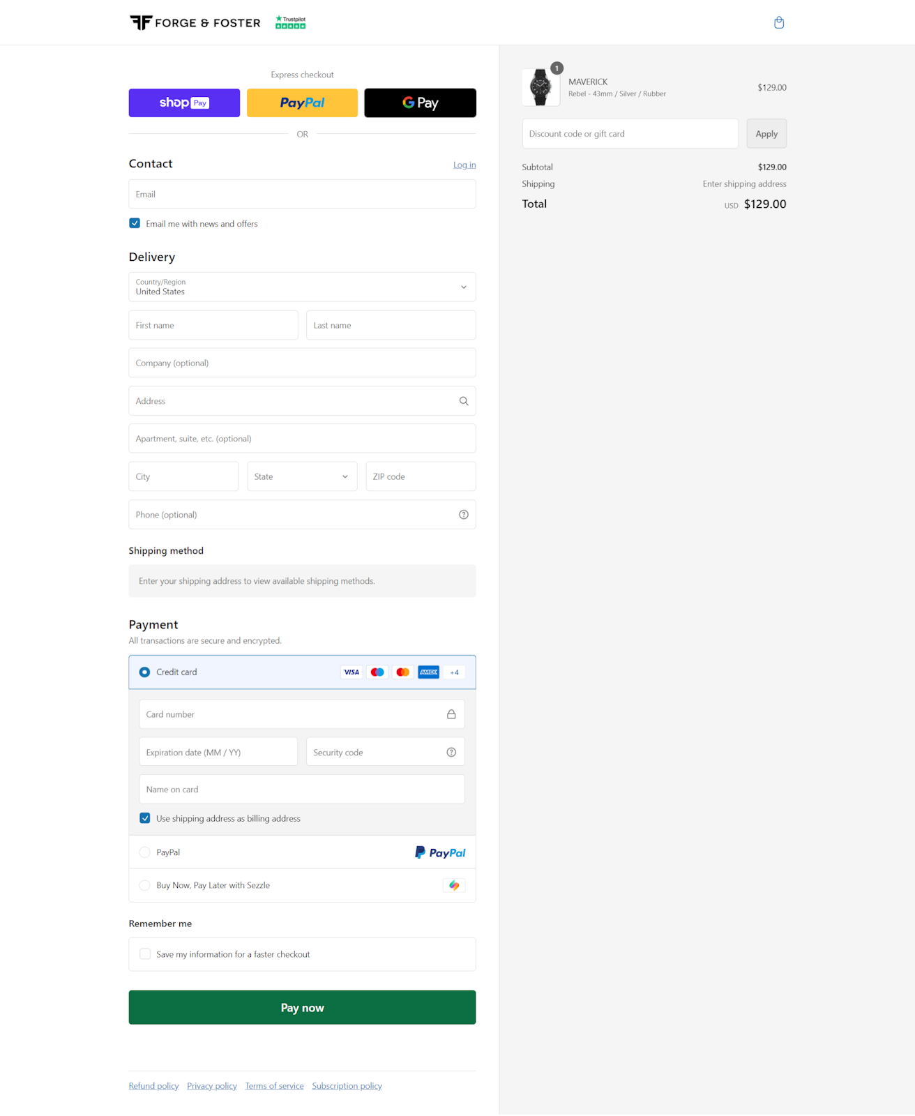
Screenshot taken on the official Forge & Foster website
Implementation style: true one-page checkout
This one-page checkout collects numerous details. The "Save my information for a faster checkout" is a noteworthy feature. The shopper can choose whether they want to be recognized in the future for a speedier experience. Another way to reduce the time spent on manual data entry is to pay with the provided express checkout options.
As it's a Shopify store, you can pay with popular options such as PayPal, Google Pay, and Shop Pay. Highlighting all these payment methods at the top of the page caters to customers looking for a quick, hassle-free purchase process.
In short, the layout is well-organized, clearly separating contact, delivery, and payment information. This Shopify checkout design is simple and clean, with plenty of white space.
Yet, it may still look too long. And where are visible security assurances? Security badges or SSL certificates near the payment information may be a good testament to transaction security.
4. Nike
.png?width=490&height=484&name=unnamed%20(20).png)
Screenshot taken on the official Nike website
Implementation style: accordion checkout
Another simple and convenient one-page checkout. It's also illustrative as product thumbnails accompany the cart contents. Plus, you can edit the shopping cart (the size or quantity), remove the product, add it to the wish list, or wrap it as a gift.
The store lets you choose how you want the order delivered: ship or pick up. The latter can be particularly appealing in urban areas where pick-up might be quicker or cheaper.
Strengths:
- Progressive disclosure: Revealing information progressively can help maintain a clean interface and reduce the feeling of being overwhelmed.
- Live chat option: You can get immediate support.
Weaknesses:
- Segmented flow: For some, this single-page checkout can be a drawback because it doesn't reveal the total number of steps involved. It can potentially frustrate users who prefer to know the checkout length upfront.
5. Casper
.png?width=612&height=453&name=unnamed%20(21).png)
Screenshot taken on the official Casper website
Implementation style: accordion checkout
Casper, a bed retailer, has a straightforward one-page checkout that embraces the company's identity. The checkout process consists of clear, numbered steps: Contact Information, Shipping, and Payment.
Apart from that, Casper does well in highlighting savings directly in the order summary, which can incentivize users to complete the purchase. It also showcases advantages like a risk-free trial and free delivery in the lower right corner. This gives consumers even more confidence, and the seamless introduction ensures that this area isn't a huge distraction.
However, this page isn't immune to drawbacks either. The first one revolves around the inability to predict the amount of information required to fill out. nother is that you have to leave an email address to proceed to complete checkout. This may deter customers who are wary of providing personal information upfront or receiving marketing emails.
Organizing checkout pages: wrapping up
One-page checkout is a decent alternative to multi-page checkouts. It boasts simplicity, speed, and higher chances of converting visitors into customers. Yet, you should switch to this checkout style with caution. If you just condense all the steps from your current three-page checkout into one page, there is a high risk of overwhelming users.
Here are the three key steps to improve your one-page checkout:
- Remove unneeded fields.
- Get rid of excessive elements.
- Optimize page loading.
To get more insights, analyze user behavior on the page and feedback. Employ modern technologies like AI and machine learning for predictive typing, auto-filling, and personalized recommendations. Try a one-page checkout now and see whether it works for you.
Published July 18, 2024
.jpg?width=64&name=unnamed%20(11).jpg)


