For over ten years, Divante has empowered eCommerce by delivering bespoke and open-source solutions to leading brands all over the world.
Our dynamic, double-digit growth has pushed the company into a new era. We have outlined a new mission, to become a top-of-mind global eCommerce brand, and to deliver the innovative technology solutions that others speak about but don’t take risks to deliver.
It’s a bold statement… One that we felt meant we needed a bold new look to our brand to match our ambition. This is the story behind our new brand identity.
The New DVNT Symbol
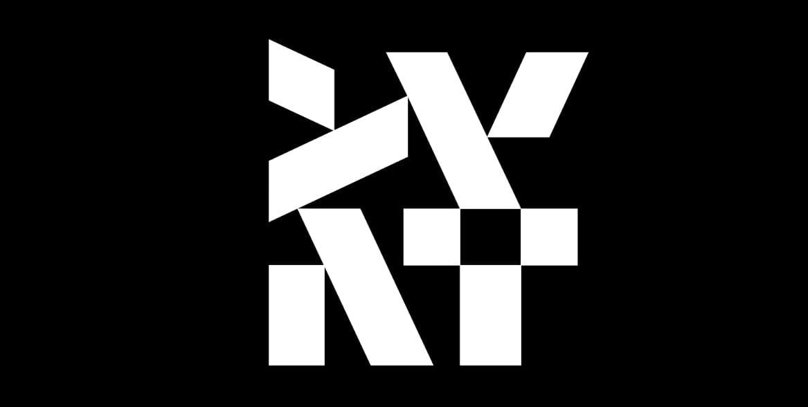
We wanted something that has a reveal. Something that takes a second or two to interpret but then makes a big impact. At first sight, our new brand symbol looks like a QR code, which is a technical symbol in itself. It then emerges as DVNT, the core of our brand.
Our color palette
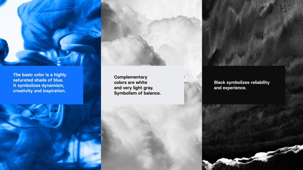
After we chose the bold and striking blue color, it was announced as Pantone’s color of the year—which was a good sign we were getting it right. It ensures continuity with our legacy brand identity, but the new blue is richer and more impactful. We also found that the old logo struggled on dark backgrounds and on mobile devices. As a company that is absolutely at the front of mobile tech, we want to make sure that everything we do works on any device. Our brand identity needs to match the solutions we deliver, looking sharp anywhere and always.
Design at Divante
Over the last decade, we have gained a reputation for making eCommerce look brilliant. Our product designers, UX and UI specialists, and architects implement brave designs that look good and work harder to improve conversion rates. We don’t just follow best practices, we redefine them—and our legacy branding was no longer able to reflect that. Our own visual identity had fallen behind that which we were helping some of the world’s leading brands to create and maintain.
“Just like the people who work there, a company changes over time. We realized that our branding no longer reflected Divante’s strategy and offerings well. More than half of our work for clients now is in areas like design, R&D, and mobile-first, which didn’t exist at our firm just five years ago. We needed our branding to catch up with our innovation.”
Dawid Pawlicki, Head of Marketing, Divante
The Divante logotype
We use Roboto and Basier as our fonts, but we chose a custom option for our logotype. It’s clear, elegant, minimal, and somehow unique. Why no capital D? We looked at it one away, then the other, then back again. And, sometimes, you just have to go with your gut feeling. It seemed modern and not so self-important—and a number of major companies have come to the same conclusion during their own rebranding processes. Small letters, big impact.
Shapes
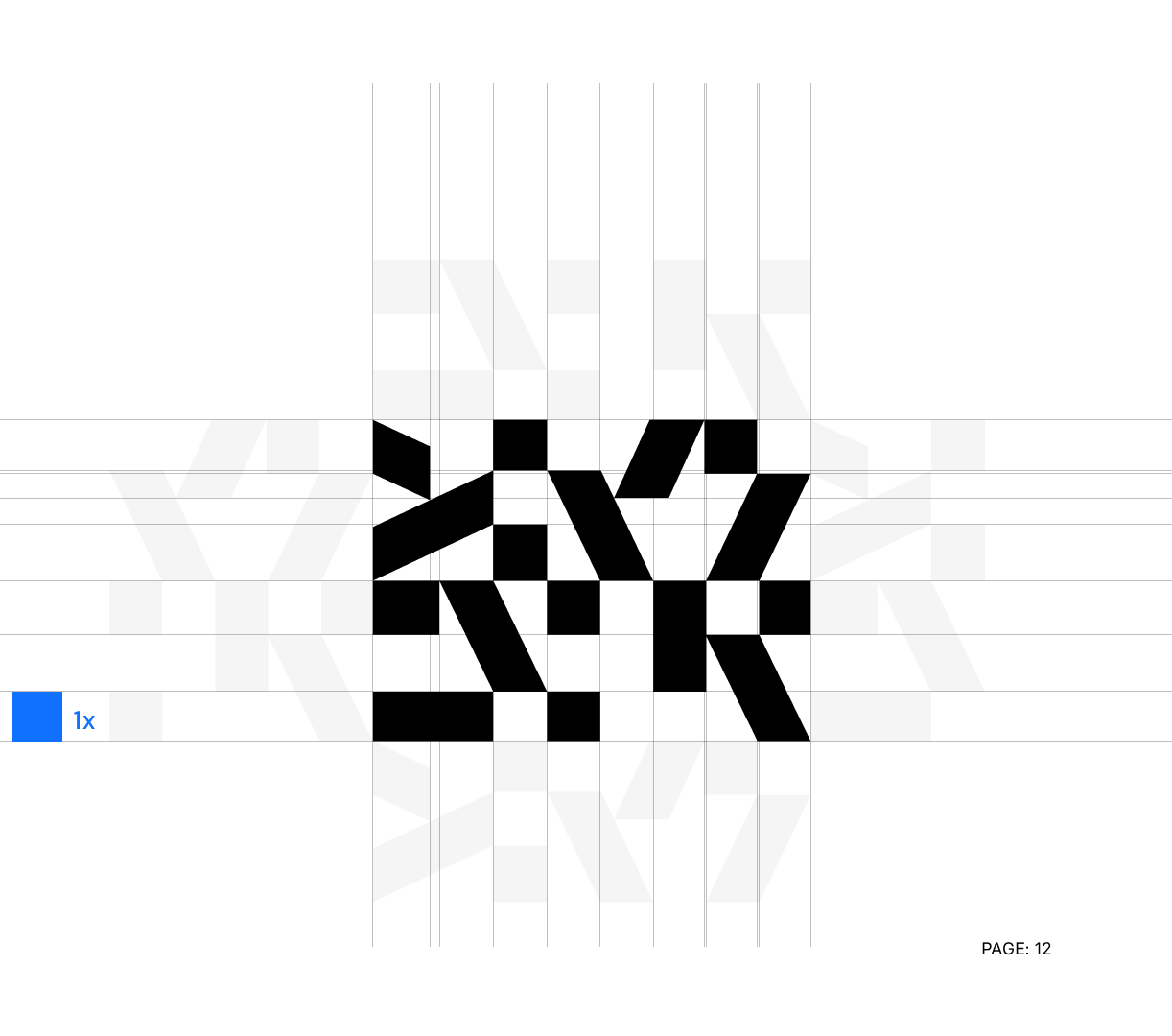
The geometric shapes in our new branded materials have sharp edges, like the technology we work with. In our marketing, these elements start out as unconnected elements, then come together to form patterns. They represent what we give to clients—taking complex and seemingly unconnected processes and bringing them together as one.
“When you’ve been on the market for 10 years, redesigning your brand is a bold move with risks attached. Such a change is not just a lifting of the company’s Social Media profiles and website. It involves every medium and every platform on which your brand has ever interacted.”
Monika Wąs, Communication & Brand Manager, Divante
Our DVNT company values
Our people were the start and end points of our rebranding process. The initial decision to revamp our image was because we wanted, as a bottom-up organization, to represent our people and our values.
Our internal teams are split into tribes, each of which has its own unique insignia made up of the geometric elements. These same shapes come together in our new logo, and the four letters they spell out also represent the values that our people identified as our core company values. Every time we see our logo, we remember what we stand for:
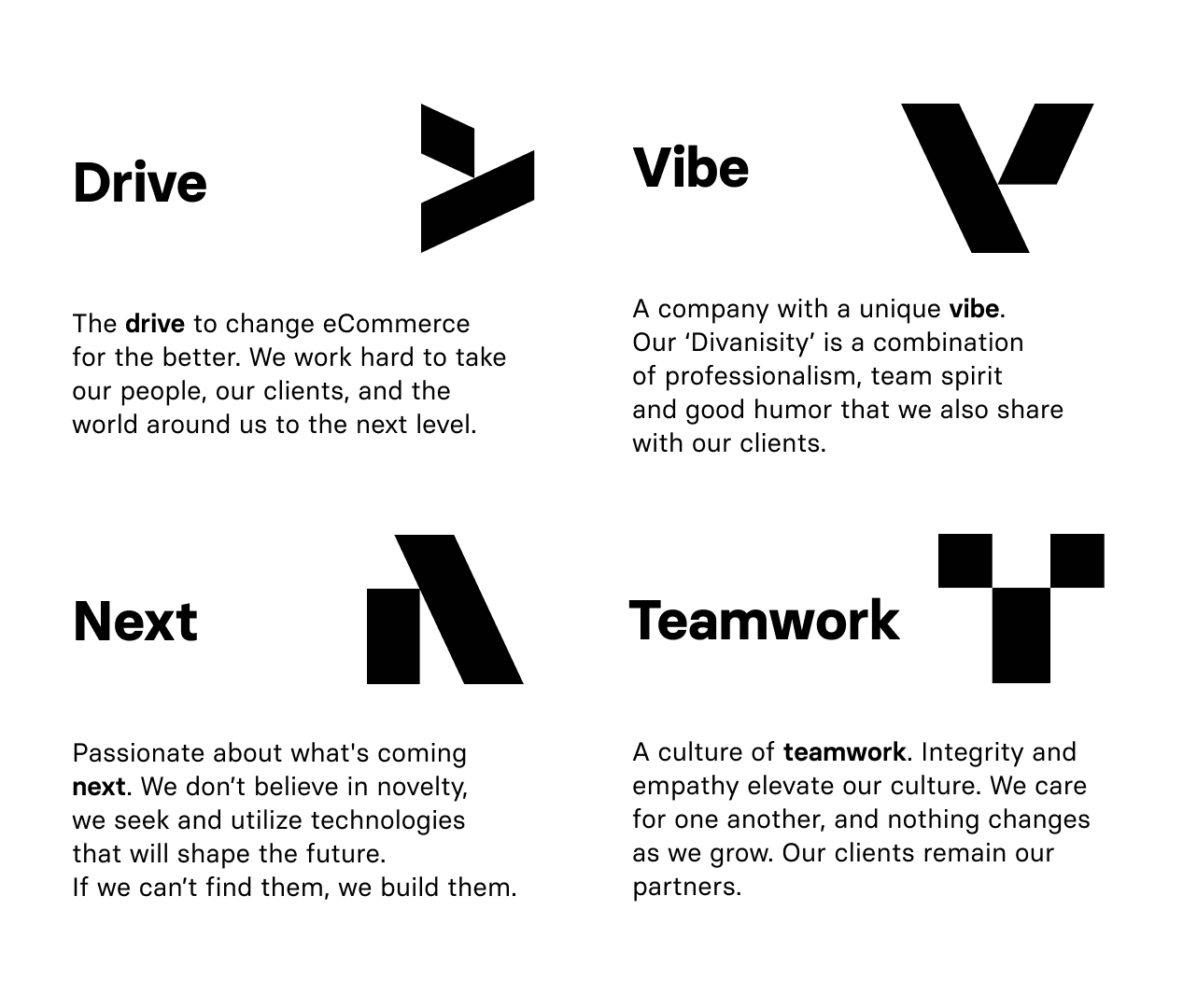
Order from chaos. Right now, explaining how all of this fits together, it seems like we carefully planned it all in minute detail. But the branding itself is a metaphor for how these things come together. A million disparate ideas at the beginning. Some false starts along the way. Then it all comes together to form a picture-pattern that was always there. We just needed to put all the pieces in the right place to see it.
“Some say the values should come from the company directors. Together with the Management Board, we decided they should come from our people who, like the values, are the core of Divante. We defined four DVNT values that are relatable and believable—and that we can truly call “ours”.
Alicja Wojtowicz, Employer Branding Specialist, Divante
Want to take a deeper dive into our new identity, who were are, and how we communicate with the world?
Download our Brand Guide here.
Check our new website with that shows off our new visual identity at https://ecommerce.cloudflight.io/
Published February 6, 2020


